Cool makeup looks creative enough to actually wear usually hit a wall between runway fantasy and real life.
The twenty ideas below thread that needle at every price point, from a $7 NYX liner to Urban Decay palettes, with one deciding factor: how much negative space you leave between the detail and the rest of your face.
Get that gap wrong and even a single cloud drawn in white liner collapses into costume; get it right and wave-foam shadow at the lash line reads as actual water catching light.
1. Ocean Eyes
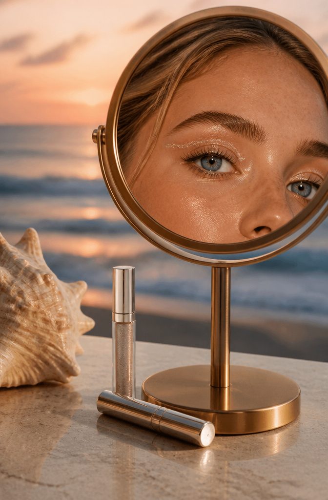
Wave-foam effects along the upper lash line turn a standard blue eye look into something that actually reads as water.
The trick is L’Oréal Paris Brilliant Eyes Shimmer Liquid Eye Shadow in String of Pearls, tapped right where a breaker would leave its white crest.
That single strip of shimmering white does the work of ten blended blues; it catches light like surf rather than sitting flat like costume paint.
I finish with L’Oréal Paris Bambi Eye Washable Mascara, which opens the lash line enough that the foam detail doesn’t get lost in a squint.
The droplet shapes under the eyes, if you want them, stay sharper when the lashes above are defined but not clumped.

PRO-LEVEL PERFORMANCE WITH INTENSE METALLIC COLOR: Achieve bold, precise lines that last up to 16 hours with this creamy, smudge-proof eyeliner designed for professional results and creative, electrifying eye looks.

Rich, fluid & as life-proof as ink

The information below is per-pack only
2. Watermelon Makeup
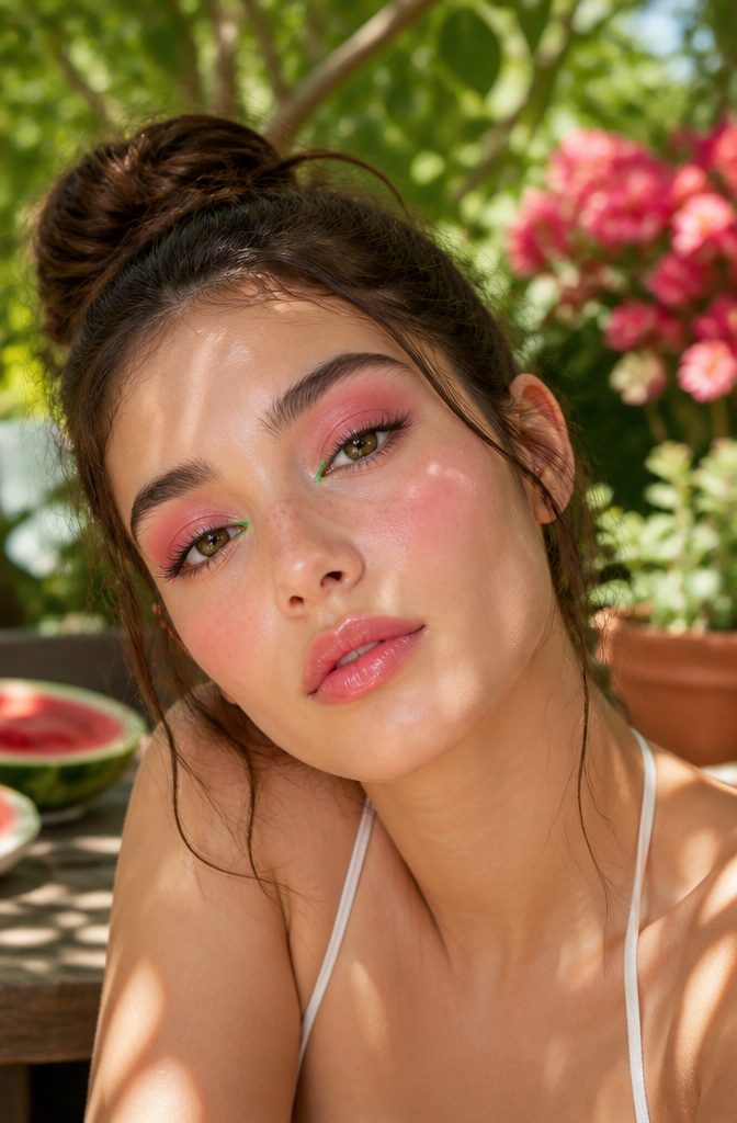
Pink and green together on a face reads juvenile until you place it deliberately.
The watermelon makeup look works because the two tones never actually touch: a wash of cool pink across the lids and cheekbones, stopped clean at the orbital bone, with a thin stroke of matte green liner drawn only at the inner corner or along the lower lash line.
The rind effect, if you want it, belongs on the lips: a deeper pink center faded outward to a clear gloss, or a green pencil traced just at the vermilion edge for the brave.
Keep the green matte and low-saturation, almost gray-olive, or it will shout over the pink and flatten the whole thing into costume territory.
Cream products blend faster and move more like actual fruit flesh than powders do, though a powder shadow set with a damp brush gives sharper edges if your eye shape needs the structure.
L’Oréal Paris counts this among the summer-season ideas, and the logic holds: the colors need heat and humidity to feel intentional rather than desperate. In dry winter light the same face looks like a color-theory exercise.
The lip variation, watermelon lips specifically, has carried the trend further than the eye version, probably because a mouth is easier to read as "fruit" than an eye ever will be.

Brilliant Eyes is a high impact shimmer eye shadow in a lightweight liquid formula - The shadow glides onto eyelids effortlessly without feeling greasy

HIGH-SHINE METALLIC EYESHADOW: Get an amped up eye look with this formula packed full of pearls for a high shine, reflective, one-swipe metallic coverage.

Ultimate Shimmer and Glow: Brightening liquid eye color in one shot. Our new innovative liquid eyeshadow is a lightweight, buildable make up formula with no flaking, no fallout, no glitter only long-lasting shimmer
3. Cloud Blush
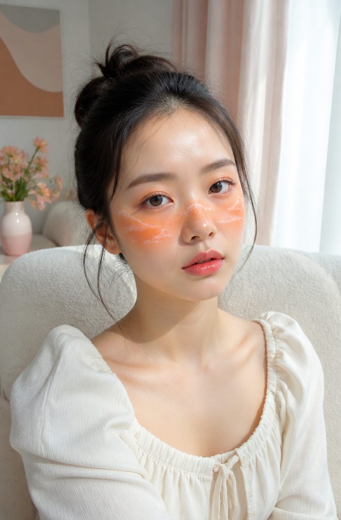
Cloud blush lands somewhere between a technique and a daydream. You start with soft smudges of color placed across the cheeks and the bridge of the nose, each patch standing alone with space between them.
A shade like Marigold from L’Oréal Paris Age Perfect Radiant Satin Blush works here because the warmth reads against skin without hard edges.
The real move comes next: drawing small, fluffy clouds in white eyeliner directly over each smudge, leaving the color peeking out at the edges like sunset behind actual cumulus.
Keep the white linework loose and the edges irregular; symmetry kills the effect and turns it childish.
I have seen this read as costume on some faces and as genuine atmosphere on others, and the difference is almost always how much negative space the wearer leaves between each cloud.
The nose placement matters more than you would expect; skip it and the cheeks look spotted, but connect them too heavily and the whole face flattens into a mask.
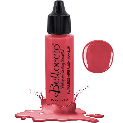
Blush Can Be Applied Before Or After Belloccio Foundation.

6 Colors SOUTHERN BELLE Gel Polish Set (6*7.5ml /0.25oz *6): Trend-researched shades to showcase your style. This color set beauty gift sets includes watermelon red, pastel pink, mint, palace green, light blue and silver shimmer. These versatile candy color gels can be layered with the shimmer nail polish in the set to create a variety of nail art styles, sweet and personalized. Shade Numbers: 707-708-709-710-711-712. It's also a great gift for women.

Ultimate Shimmer and Glow: Brightening liquid eye color in one shot. Our new innovative liquid eyeshadow is a lightweight, buildable make up formula with no flaking, no fallout, no glitter only long-lasting shimmer
4. Neon Cut Crease
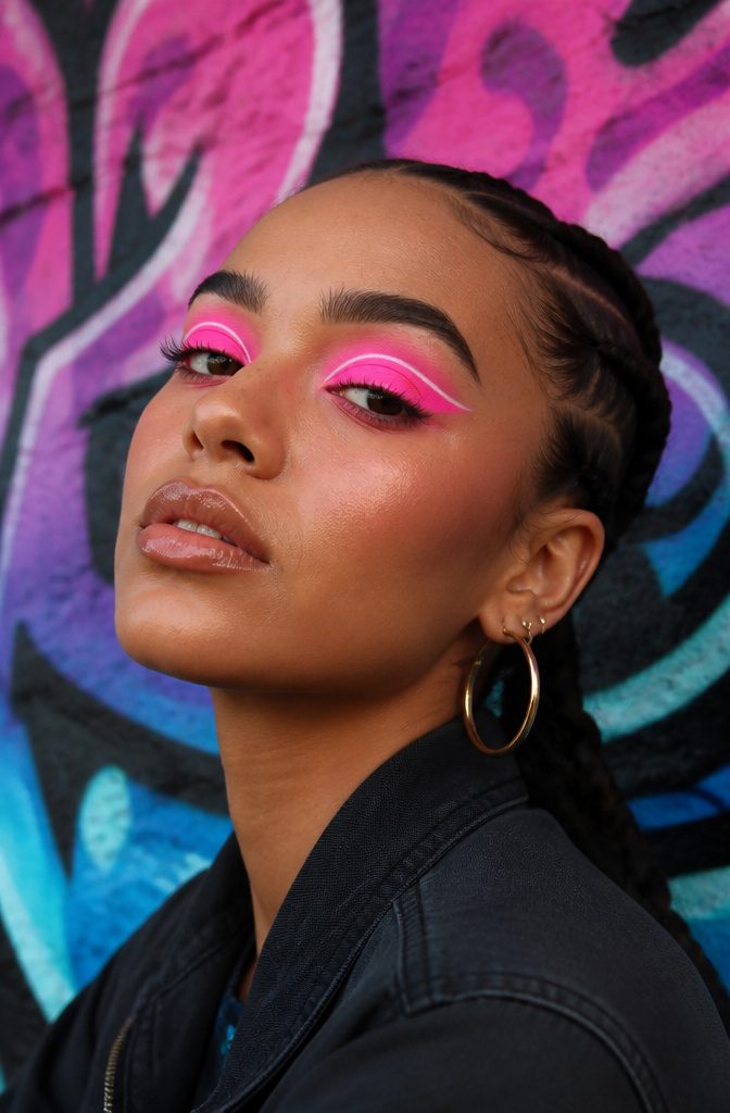
A neon cut crease reads as pure stage lighting on the face, and the trick is simpler than the finished look suggests.
Bright shadow, hot pink or electric green, gets laid down as a sharp crease line first. The neon glow itself comes from a thin stripe of white liquid liner drawn straight down the center of that cut crease.
That white strip catches light and tricks the eye into reading the surrounding color as lit from within, which is what separates this from just wearing loud shadow. The graphic shape matters as much as the color.
A clean, hard edge keeps it editorial rather than costume. I have seen this done with the white line too wide, and the effect collapses into a pale stripe floating above the lid.
Thin wins. Keep the rest of the face quiet, or the whole thing starts shouting from too many directions at once.
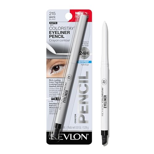
LASTING EYELINER: Rich color looks freshly applied all day long; transfer-proof, waterproof, smudge-proof and fade-proof
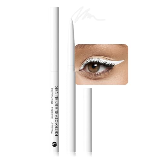
❤️【4 Colors Colorful Eyeliner Set】4 different colors eyeliner pen including Black White Blue and Brown. Blue is perfect for adding a pop of color to your eyes without being overwhelmingly bold. Brown is perfect for those who prefer a softer, more natural look. Black can offer classic, fail-safe boldness we all crave. White is not merely a brightening tool to use on the waterline for bigger, brighter eyes; it can also be used as a base for eyeshadows to make colors pop or to create artistic, avant-garde looks.
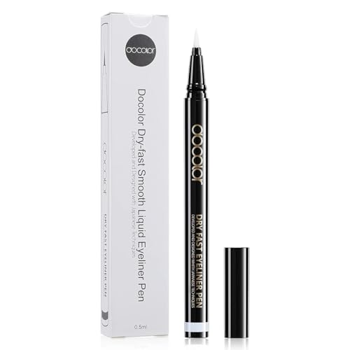
𝐃𝐨𝐜𝐨𝐥𝐨𝐫 𝐍𝐞𝐰 𝐋𝐢𝐪𝐮𝐢𝐝 𝐄𝐲𝐞𝐥𝐢𝐧𝐞𝐫: Our waterproof liquid eyeliner provides smudge proof, flake proof, cry proof staying power. The ultra fine brush tip lets you create any look, from thin delicate lines to bold cat eyes.
5. Flame Under-Eyes
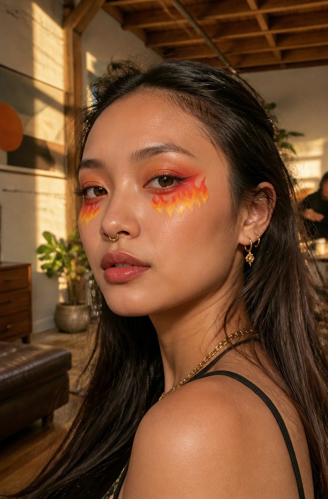
Cool makeup looks creative enough to actually wear usually hit a wall between runway fantasy and real life. The flame under-eye style threads that needle better than you would expect.
You start with a bright yellow shadow, highly pigmented, right at the lower lash line and carry it about an inch downward.
Orange fills the middle band, red edges the shape and anchors the bottom. The outline matters more than the pigment — without a clean flame contour first, the colors bleed into clown territory.
What surprised me, reading through the tutorials, is how wearable the heat palette becomes when you keep the shape small.
A one-inch drop keeps it visible but not theatrical. Scale up and the same colors turn costume fast.
The irony of the look is built in: it is literally fiery, which makes it the opposite of cool in temperature, yet it sits in every list of cool makeup looks creative enough to try.
That contradiction is part of why it works. The wearer gets to be both hot and cool, which is a rare balance in experimental makeup.

HIGH-SHINE METALLIC EYESHADOW: Get an amped up eye look with this formula packed full of pearls for a high shine, reflective, one-swipe metallic coverage.

【The Effect You Want】Professional glitter liquid eyeshadow,highly pigmented, waterproof, strong adhesion.Pressed glitter eyeshadow long-wearing sparkle eyeliner lavishes eyes with incredible glitter and shimmer

Shimmer That Stays: Maybelline Shadow Drip, the shimmering liquid eyeshadow tint that delivers captivating eye looks without compromising on comfort. Lightweight, refreshing feel and high-impact shimmer that stays put up to 16 hours
6. Galaxy Look
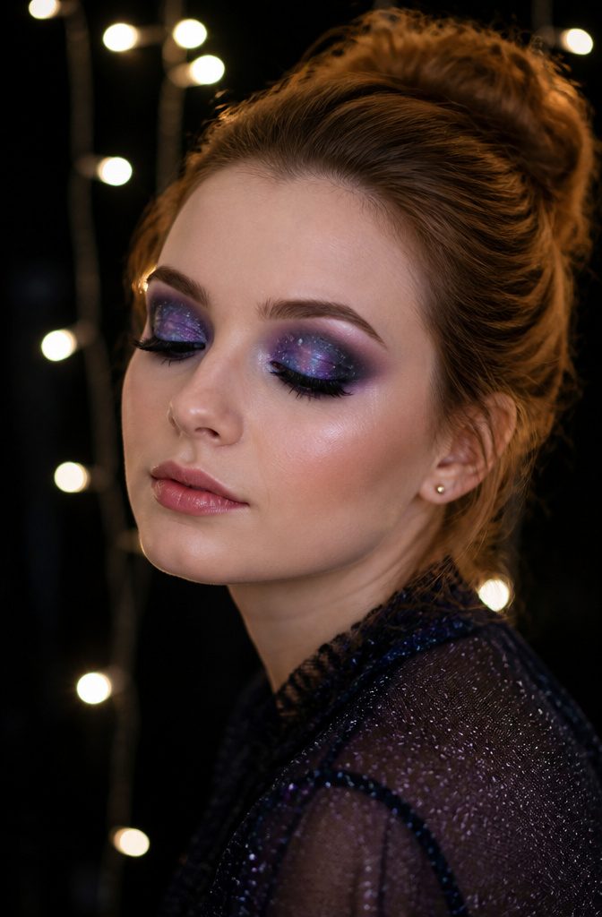
Deep purples, blues, and blacks sponge-blended across the lid create the night-sky base, with fine white dots layered on top for stars.
James Charles popularized the approach, and the technique is forgiving: uneven blending actually reads as nebula density rather than a mistake. A dash of glitter gives the stardust effect without requiring precision work.
The look works best when you commit to either the eyes alone or a full face map. Half-measures read as smudged eyeshadow rather than intentional galaxy.
Sponge-blending is the non-negotiable step; brush application leaves edges too clean for the cosmic blur you want. Basic face paints handle the job, so this is one of the more accessible creative looks to attempt without a pro kit.
7. Optical Illusion Makeup
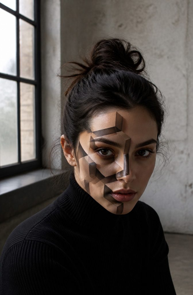
Optical illusion makeup turns the face into a visual puzzle that rewards steady hands and patience over expensive products.
Artists like Mimi Choi have built followings by splitting faces in half or painting them to look like they’re melting, effects that rely on careful shading and precise line work rather than bold color.
The technique is achievable with drugstore pencils and cream shadows if you understand perspective enough to map where light would hit an impossible shape.
I spent one evening trying to paint a dripping jawline on myself after watching a tutorial; the lines kept going wobbly where I rushed the transition from highlight to shadow, and the whole thing read as smudged eyeliner from three feet away.
The fix was slowing down and building the darkest tone in layers, letting each one set before adding the next. What separates a convincing illusion from a messy experiment is usually five extra minutes of blending at the edges.

Sparkling Effect: The color is highly pigmented and natural bright, also has a glitter smooth texture with shimmering effect to make your eyes sparkling

【High Pigmented Glitter Makeup】Create all the looks you want with a high-precision tip for smooth, intense color.

Intense Glitter Eyeshadow: Oulac long-lasting liquid eyeshadow colors are so bright that with just one swipe, which will bring amazing metallic colors and a glamorous prismatic effect
8. Animal-Inspired Designs
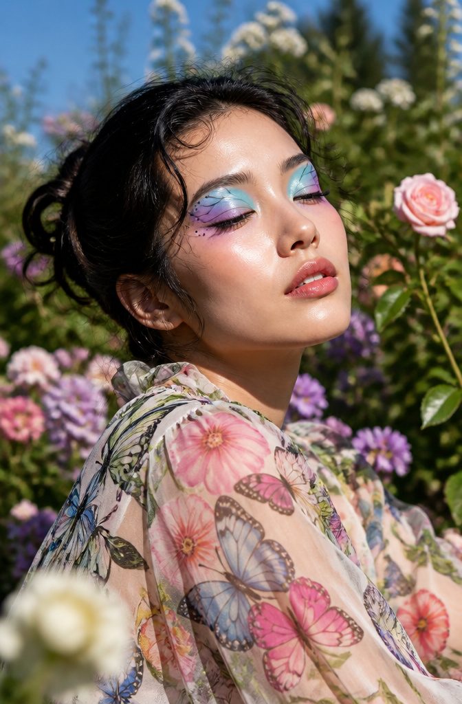
Tiger stripes across the temple can read costume-shop fast, but the same motif shrunk to eyelid scale changes the whole effect.
Butterfly wings land there naturally: the shape follows your lid’s own geometry, and the color gradients you build from inner corner to brow bone mirror real wing patterns without needing photorealism.
A study of event makeup found these designs peak at Halloween and cosplay conventions, which tells you where the line sits between wearable and performance.
For a look that survives normal lighting, start with smaller motifs and let the animal reference come through palette and placement rather than literal replication.
A coral-and-ink pattern suggestive of fish scales along the lower lash line, or the warm gradation of a fox’s coat pared to two crease colors, gives the creative payoff without the mask effect.
The mistake is treating the face as a canvas for accuracy when the eye reads suggestion faster than detail.

Meet Your Matte Match: Say hello to the matte lipstick that actually gets you. Made for busy days and bold nights, our formula delivers everything customers want: rich pigment, glide-on ease, and a lightweight naked-lip feel. No heavy formulas, no dryness, just confidence in every swipe.
A new generation of highly pigmented, long-lasting, exclusive shadow that reinvents color intensity.

VIBRANT COLOR LIPSTICK: Milani knows that the best way to make an entrance is by making a statement. Feel confident wearing Color Statement Lipstick in a variety of vibrant colors.
9. Pop Art Makeup
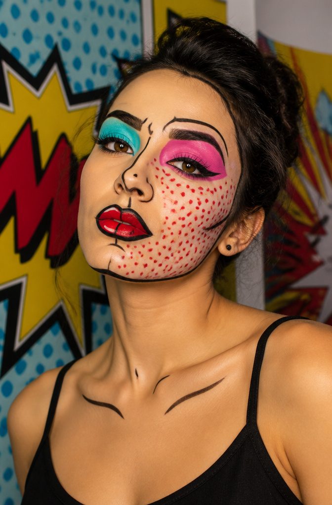
Pop art makeup turns your face into a living Roy Lichtenstein panel, built from flat blocks of saturated color and thick black outlines that read as cartoon rather than contour.
The style went viral on social media for a reason: it photographs flatly and recognizably even under bad light, which is more than can be said for most blended editorial looks.
Highly pigmented eyeliners and a steady hand are the non-negotiables here, since the whole effect collapses if your black line wobbles or your red reads pink.
Dot patterns, usually applied with the round end of a makeup brush or a pencil eraser dipped in cream color, give the Benday texture that sells the comic reference.
The mistake most people make is trying to shade or blend; this look wins when you refuse to.
Pick three colors at most, lay them down opaque, lock them in with powder, then draw your outlines last while the shape is still fresh in front of you.

Cruelty-Free: Made with ingredients that are not tested on animals

Retractable Eye Liner: A line and defined eye is just a twist away with this eyeliner pen; Intense pigment covers like a liquid eyeliner while its creamy formula holds for hours; No need to sharpen just twist up and apply for a winged out eyeliner look

PRO-LEVEL PRECISION AND IMPACT: Achieve flawless, bold eye looks with a professional-grade felt tip that delivers intense pigmentation, smudge-proof wear, and effortless control for confident, creative expression.
10. Nature Elements
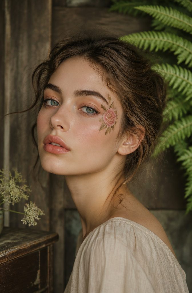
Nature elements makeup turns the face into a canvas for small details that carry real weight: a single rose painted at the temple, a vine tracing the brow bone, a wash of ochre and moss that reads as landscape rather than color scheme.
The restraint matters more than the concept. A full forest across both cheeks looks like costume; one acorn tucked beside the eye, or a leaf’s negative space cut into a cat-eye flick, reads as inventive.
Tal Peleg’s work makes the case for this economy. A rose near the eye, scaled to no larger than the iris, can shift the whole mood of a face without demanding a themed outfit to match it.
Earth tones do the heavy lifting: raw sienna, olive, a muted terracotta. These bridge to actual wardrobes, the kind already hanging in most closets.
The practical risk is texture.
Pressed petals or actual leaf fragments photograph well and flake within the hour. Water-activated body paint holds through an evening, and a fine liner brush delivers the organic shapes that read as leaves rather than green geometry.

Ultimate Shimmer and Glow: Brightening liquid eye color in one shot. Our new innovative liquid eyeshadow is a lightweight, buildable make up formula with no flaking, no fallout, no glitter only long-lasting shimmer


AMPED UP EYE LOOK: Get an amped up eye look with e.l.f. Liquid Metallic Eyeshadow! This liquid eyeshadow delivers a high-impact, metallic finish through multi-dimensional metallic pearls. The shade Meteor is bronze with golden bronze shimmer.
11. Glow-in-the-Dark Makeup

UV-reactive pigments have moved from novelty to something people actually plan around. At music festivals like Coachella and events like glow runs, the makeup only exists once the blacklight hits it, which changes how you build a face.
Layering neon colors is the usual approach, but symmetry matters more under fluorescent light than it does in daylight, where an off-balance wing might just read as artistic.
Under blacklight, uneven lines look like a mistake in the chemistry rather than a choice.
The popularity has grown enough that brands now label products for UV reactivity rather than leaving you to test them under a club bulb.
A friend of mine bought a pigment marketed as "glow" that turned out to be shimmer in normal light and nothing under blacklight.
The workaround is checking for the specific UV-reactive or blacklight-reactive claim on the packaging, not the generic glow promise.
For a striking effect, the eyes and cheekbones catch light first, so placing pigment there gives the most payoff for the effort.
12. Fantasy Characters
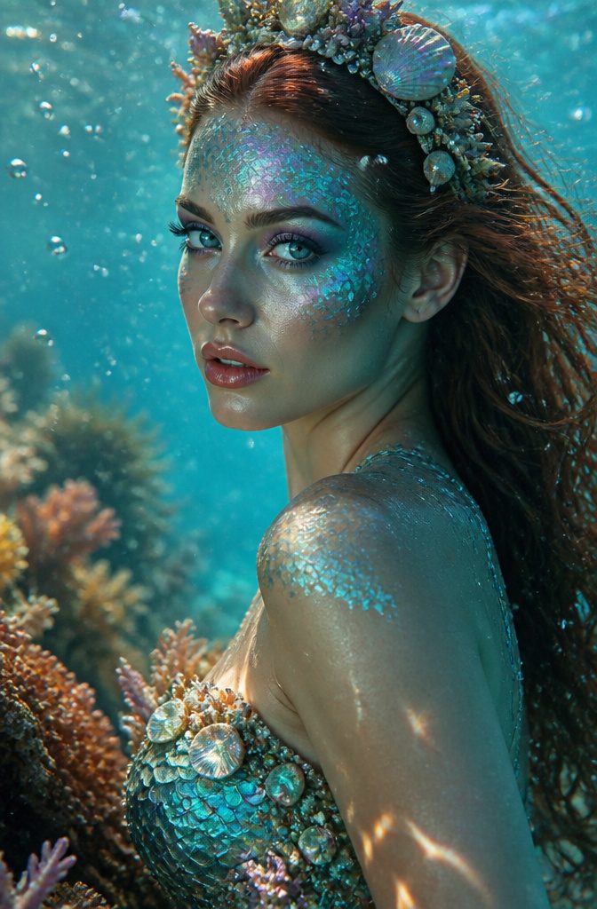
Fantasy character makeup turns the face itself into the costume.
A mermaid look builds on shimmery pigments packed across the cheekbones and temples, catching light the way scales would; the same technique shifted upward with finer glitter placement reads as fairy instead.
Elves need the sharper architecture: stronger shading at the hollow of the cheek and a deliberate lift to the brow bone that prosthetics would achieve in film work, but careful contouring reaches without the extra pieces.
Dragons run the other direction, with heavier pigment load and a drawn scale pattern at the temple that most people overdo.
Three shades maximum for the base keeps any of these from tipping into costume-shop territory; the magic sits in the gradient, not the color pile.
Glitter placement is the make-or-break detail. Inner corner and high cheekbone only, never both eyes full lid plus cheek unless the brief actually calls for disco fairy.
The sources agree that clever shading outperforms added pieces for anything short of a stage distance of ten feet or more.
13. Minimalist Abstract Art
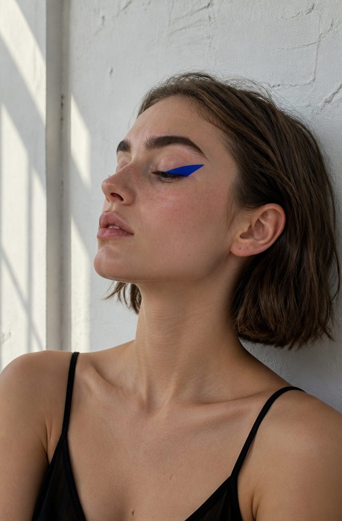
Sharp triangles, dots, or zigzag lines placed asymmetrically on the face turn a bare lid into something gallery-worthy without the pressure of a full beat.
The style relies on clean lines and deliberate negative space, which makes it forgiving for beginners who still want a creative result.
I reach for this when I have fifteen minutes and no patience for blending; a single cobalt triangle at the outer corner, or three staggered dots tracing the brow bone, reads as intentional rather than unfinished.
Color choice matters more than complexity here. One bold shade against skin does the work that gradients usually do, so a cheap liner with strong pigment outperforms a pricier formula that needs layering to show up.
Placement is the only real variable: asymmetry keeps it modern, but the shapes themselves should stay simple enough that a steady hand and a ruler, or even the edge of a business card, can guide them.
14. Emotive Art
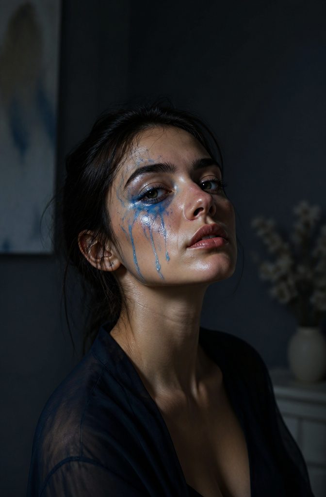
Emotive art makeup turns the face itself into a canvas for feeling. Painting realistic tears down one cheek, or an exaggerated smile that extends past the natural lip line, makes the emotion readable from ten feet away.
The work sits somewhere between portrait and performance: you are both the artist and the medium.
Color choice carries the weight.
Cool blues and greys read as grief or isolation; warm oranges and yellows signal joy, though the same orange tipped into red can shift to anger with nothing more than a harder edge on the brushstroke.
Texture matters too. Glossy, wet-looking tears against matte skin create contrast that catches light differently and makes the illusion hold.
What studies in art therapy suggest is that creating these designs can be cathartic for the person applying them, not only for whoever sees the finished look.
The face becomes a storytelling surface, and the story can change by the hour.
15. Indecisive Eyeliner
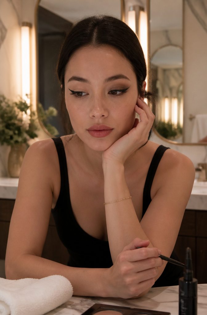
The indecisive eyeliner look works because it admits something most of us feel: standing at the mirror, two ideas in hand, unable to choose.
Instead of forcing a single line, this style wears the hesitation openly. One eye might carry a sharp flick that dies halfway across the lid; the other gets a soft smudge that never commits to a shape.
Or a single eye splits the difference, a wet wing layered over a dry pencil stub that stops and starts at different angles.
What saves it from looking like a mistake is the gap between the lines must read as intentional space, not unfinished business. The contrast in texture matters more than precision.
A liquid wing paired with a kohl ghost line an eighth-inch below it gives the eye something to puzzle over. Powder shadow dragged through the middle can bridge them, or leave the channel bare for a starker effect.
This is not a look for tight schedules. The time it takes to make uncertainty look considered is roughly double a clean wing, since each line gets judged against the other.
Mascara helps enormously; without it, the eye reads as slept-on rather than editorial. A nude lip keeps the focus where the work went.
The risk is real. Too many competing elements and the face tips into costume.
Two conflicting lines, maybe three, and then stop. The discipline is in the restraint.
16. Bold Wing
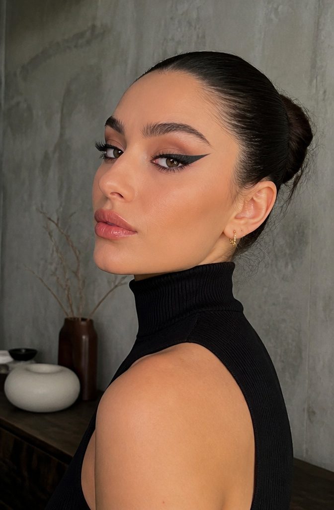
A classic winged liner reads office-appropriate; the same shape drawn three times thicker reads like a deliberate choice.
That is the jump this look makes, and the Marc Jacobs O!mega Eyeshadow in O!Snap is what makes it possible without the stiffness of liquid liner.
The formula is a gel-powder hybrid that lets you lay down a dense black and still smudge the edge with a small brush before it sets, so the wing keeps a shape but loses the sharp plastic finish that photographs harshly.
The mistake most people make is treating this like liner and building from the lash line outward.
It works better as a block: fill the entire outer third of the lid with the shadow first, then clean the inner edge and the flick with micellar water on a flat brush.
What you get is a solid wing shape that still reads soft, which matters because a bold wing this size can look costume if every edge is perfect.
Start the wing lower than your natural crease; starting too high closes down the eye and turns the look into a geometric exercise rather than something that moves with your face.
Wear it with otherwise bare skin and a lip stain, or commit and pair it with a strong brow and a neutral lip.
Either way, the shadow holds through a full day without the cracking that cream liners develop by hour six.
17. Half Moon Blue
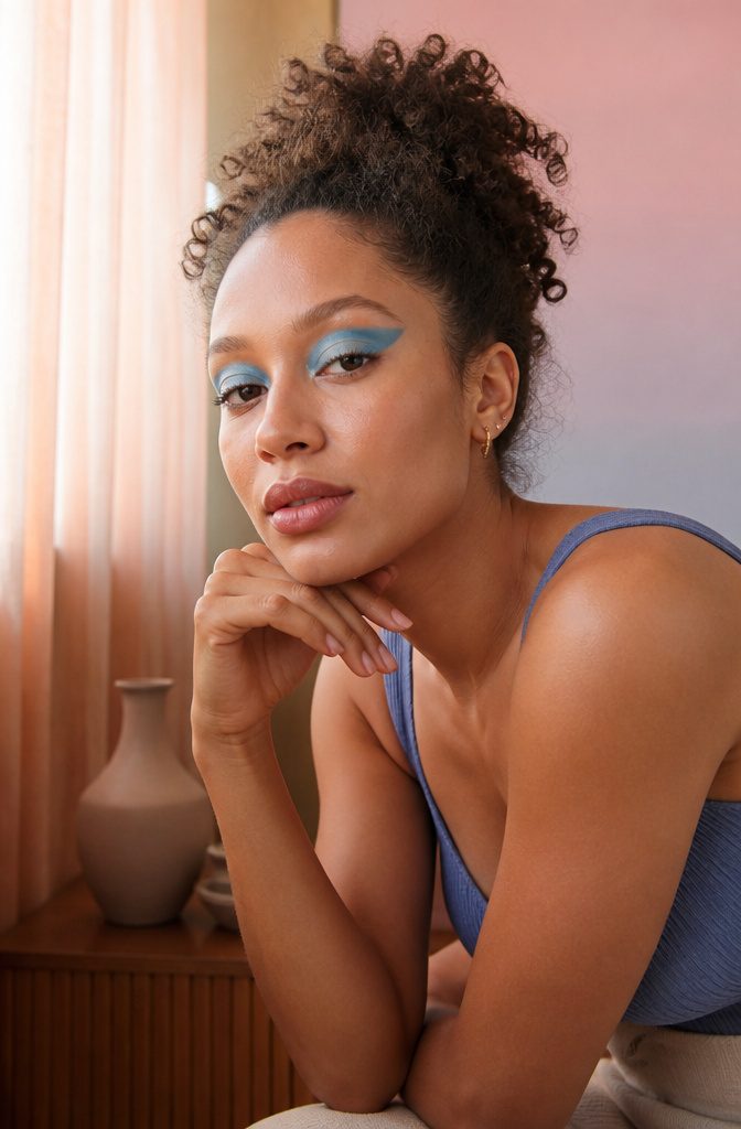
A crescent of blue sitting in the negative space above the crease gives the half moon eye its name, and the shape does more of the work than any single pigment.
You trace the curve with a fine liner first, then fill the lower half of that arc with a matte or shimmer blue while leaving the upper lid bare or set with only primer.
The gap between the brow bone and the blue is what makes it read as intentional rather than unfinished.
A stiff cream shadow works better here than powder, because you need the edge to hold without fallout breaking the line.
I have seen this done with a cobalt that leans purple and with a muted slate, and the quieter shade actually photographs better in daylight; the bold one needs evening light to settle down.
The shape flatters most when the crescent starts narrow at the inner corner and widens toward the outer third, which lifts the eye rather than dropping it.
The risk is symmetry. Freehanding both eyes to match takes patience, and the moment one crescent sits higher than the other, the whole look tilts.
A small brush and a handheld mirror, not a wall mirror, give you the angle to check as you work.
18. Neon Eyeliner
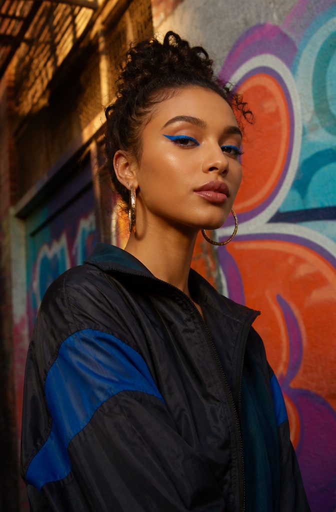
Neon eyeliner turns the classic cat-eye into something that reads from across a room.
The NYX Vivid Brights Liner sits at about $7 and delivers pigment that actually stays electric once it dries, not the washed-out version you get from cheaper liquid formulas.
A felt tip gives you more control than a brush for drawing sharp, graphic shapes; the Vivid Brights line has a decent one, though after a few weeks the tip can fray and you lose precision on the inner corner flick.
The trick, if there is one, is placement. Full neon lid looks costume; a thick wing or a floating crease line keeps it wearable for dinner or a gallery opening.
I have seen this paired with bare skin and a clear brow gel, and the contrast does more work than any smoky shadow ever could.
Matte neon reads more editorial than shimmer, which can catch light in a way that cheapens the color. The real limit is your own lid space; smaller eyes need thinner lines or the brightness starts to close them in.
19. Wavy Gradient

Wavy gradient shifts the whole idea of what a color transition can be on a face.
Instead of fading one shade into the next in a straight band, you lay down arcs or peaks that actually move, so the color seems to ripple across the lid or the cheekbone.
The first time I mapped it out, I used three cream shadows and a flat synthetic brush to stamp the shape before blending the edges, and the difference was immediate: standard ombre reads flat in photos, but this catches light at different angles and keeps changing.
The motion is what matters. A wave that crests at the outer corner and dips toward the inner eye gives a completely different expression than one that peaks at the center of the lid.
I think the most wearable version keeps the waves low and tight, almost like a topographic map, with no more than two colors that sit within the same family, say a rust moving into a deeper burgundy.
Three colors and the shape starts to compete with the structure of your own eye.
Cream formulas hold the edge better than powder, but they set fast. Work one wave at a time, blend before it dries, and accept that the first attempt will probably look muddy.
Mine did. The second try, I used less product and built in thin layers, and the ridges finally stood clean.
20. Simple Shadows
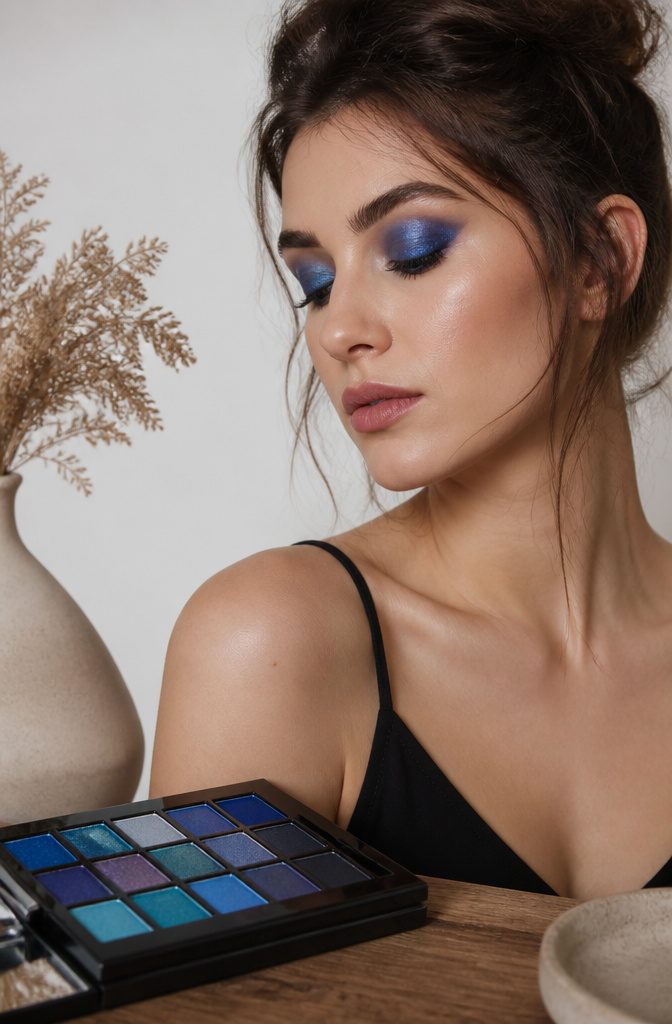
A single bold shadow, applied with restraint, reads as more deliberate than a blended-out smoky eye.
The Urban Decay Wired Palette works well for this because the pigments are dense enough to hold their shape without building. I press the color onto the lid with a flat brush, keep the edges clean, and stop.
No crease shade, no highlight, no liner. The shape stays simple so the color carries the entire look.
One bold color in a simple shape is the rule. A sharp triangle at the outer corner, a rounded wash across the whole lid, or a single dot placed asymmetrically near the inner corner.
Each reads as intentional rather than unfinished. The Wired Palette’s brighter shades, the ones that look almost too loud in the pan, flatten out to something wearable when you refuse to blend them away.
Frequently Asked Questions
What are some creative makeup looks?
Cool makeup looks worth trying include ocean eyes with wave-foam effects, watermelon makeup with separated pink and green tones, cloud blush with white linework, neon cut creases with a white center stripe, flame under-eyes in heat colors, galaxy eyes with sponge-blended purples and blues, optical illusion designs, animal-inspired motifs, pop art panels, nature elements, glow-in-the-dark UV pigments, fantasy character faces, minimalist abstract shapes, emotive art, indecisive eyeliner, bold wings, half moon blue, neon eyeliner, wavy gradients, and single bold shadows.
Each trades on a specific technique or color placement rather than standard blending.
How can I use color theory in makeup?
The article emphasizes keeping colors deliberate and separated rather than blended together.
In watermelon makeup, pink and green never actually touch; one sits on the lids and cheekbones while the other appears only at the inner corner or lower lash line.
For flame under-eyes, yellow, orange, and red stack in distinct bands with a clean outline between them.
The broader point is that color reads as intentional when placement is controlled rather than diffuse, and that heat palettes need humidity to feel right while cool blues and greys read as grief in emotive work.
What products are best for graphic liner?
For sharp graphic shapes, a felt tip liner gives more control than a brush for drawing precise lines, though tips can fray over time and lose precision.
A stiff cream shadow outperforms powder for holding a clean edge without fallout, and a gel-powder hybrid lets you lay down dense pigment and still smudge before it sets.
Fine liner brushes deliver organic shapes that read as leaves or other natural forms, while nail art brushes and fine-tipped liners work for intricate graphic work.
Water-activated body paint holds through an evening for nature elements, and cheap liner with strong pigment outperforms pricier formulas that need layering.